Logística de Transporte
Industrias

In ecommerce, the product is no longer what drives value for the customer.
Why? Because due to the ease of manufacturers and wholesalers churning out similar or even identical offerings, it’s become almost impossible for online retailers to find a point of difference through their product catalogs.
This has led to a new era in online selling where seamless experiences are the key to attracting and retaining customers.
In this climate, the customer needs to be your brand’s ‘north star’. Every decision regarding your website needs to be made with a robust understanding of the shopping journey - and all of the touchpoints that bring it together.
But what exactly are customer touchpoints, and why are they so important to the customer experience?
Customer touchpoints refer to key moments of connection between your business and your customers during the shopping journey. It starts when a customer first discovers your online store, right up to the moment when they receive their order - and beyond.
We’ve all heard the story of Hansel and Gretel, where two children follow a trail of breadcrumbs that take them deeper into the forest. In ecommerce, your touchpoints are much the same.
Each ‘breadcrumb’, whether it’s seamless site navigation or an engaging product page, should persuade your customer to continue their journey until they reach the final destination - the checkout. (Or a gingerbread house if you prefer the fairy-tale analogy).
In sum, touchpoints are about creating a positive customer experience that incentivizes them to continue moving down the sales funnel toward purchasing. Touchpoints should also ensure that once a sale has taken place, customers are left with a favorable impression that drives them to support your brand in the future.
The whole premise of touchpoints is that ecommerce is no longer centered around a transaction. If the shopping process feels impersonal, it’s an uphill battle for merchants to build brand loyalty.
It’s all too common an experience for online shoppers to receive fantastic customer care during the browsing process - only for this to disappear once a purchase has been made.
It’s this cold, sales-driven mentality that increases customer churn and makes it impossible to build a loyal customer base.
But there are plenty of brands out there who are doing it right. D2C mattress brand Casper Sleep turned an entire product category on its head by examining what consumers worried about most when buying mattresses; what if I find the mattress uncomfortable and want to return it? How will I get it back to the store?
Casper Sleep understood that the perception of risk creates friction in the shopping experience, which in turn puts consumers off from purchasing. As a result, they launched two marketable initiatives: a 100-day trial on any mattress product, and free pick-up of returned items.
By zeroing in on product trials and returns as differentiating touchpoints, Casper turned itself into a billion-dollar company within just a few years. It’s an example of what businesses can achieve if they make the end-to-end customer experience as seamless as possible.
Mapping your customer touchpoints can be an extensive process. Every customer journey is different and can be influenced by a variety of factors, such as the device they’re using to shop or whether they’re a first-time or returning customer.
That’s why it’s important to start with the basics that affect every customer during the shopping journey. We’re dividing these essential touchpoints into three categories; pre-purchase, during purchase, and post-purchase.
Imagine arriving at a brick-and-mortar store and having to wait at a locked door for someone to let you inside. How long would you wait before deciding it wasn’t worth your time?
Online, it’s about three seconds.
Slow site loading speeds interrupt the shopping journey and add a huge amount of friction to the customer experience, especially when consumers trying to browse between product offerings.
To get an idea of just how important site speed is to your online store, check out these stats:
You can improve your site speed by reducing the number of plugins, reducing image and video sizes, and ensuring that Liquid code is optimized to avoid lengthy commands.
Product pages are the backbone of every ecommerce site. With so much competition amongst similar or even the same products, ensuring that your product page is well-optimized can be the difference between an average page or one that actually converts.
Most ecommerce stores provide a few basic FAQs in the footer of their website. But relatively few put in the time to build a resource base for their customers. Why? Because most FAQ pages aren’t geared towards lead nurturing activities.
The more consumers browse your website, the more likely they are to have questions and require more information. This makes FAQs a vital touchpoint with prospective customers. By providing self-service options that empower customers to take charge of their shopping journey, you can take advantage of leads that are most likely to convert.
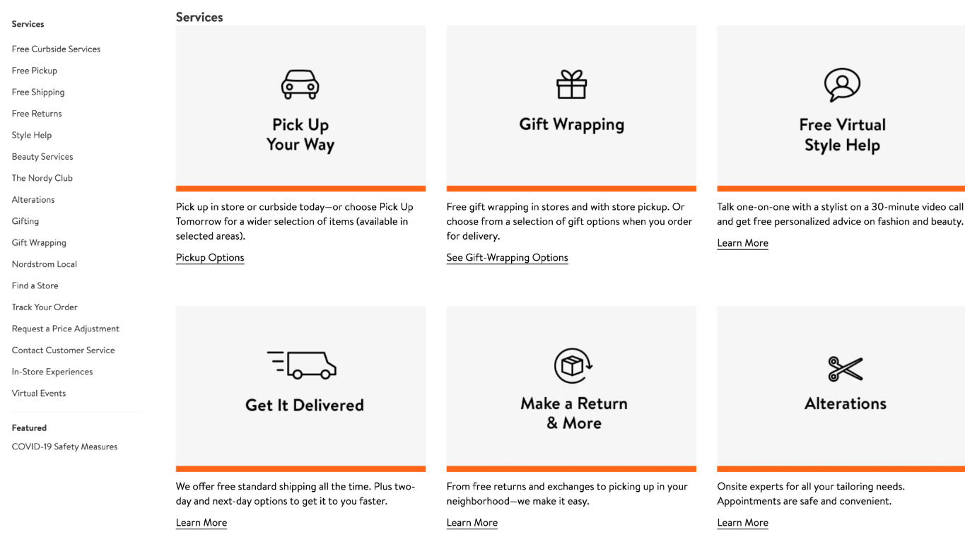
Nordstrom has built a knowledge center that’s easy for customers to navigate using both the sidebar and graphic icons. It’s both a strategy for answering FAQs and marketing its value-added services.

If your product pages are the backbone of the ecommerce store, then your checkout is the heart. This is the end destination that you want all site visitors to pass through, so you need to make this touchpoint as seamless as possible.
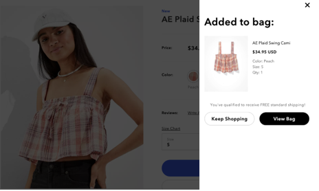
Firstly, make sure that the checkout button is clearly visible on every page of your website. If the icon is too small or doesn’t use a contrasting color, your customers may have difficulty finding it. The button should also allow customers to check the contents of their cart without having to navigate away from their current page, as shown here by American Eagle:

Optional registration is a great way to lower cart abandonment rates by removing obstacles to completing checkout. Forcing customers to fill out multiple boxes of info could lead to them deciding to come back later - and then forgetting all about the purchase. Guest checkouts help encourage new customers to commit to that first purchase while returning customers will see the benefits of storing their shipping/billing information for future use.
There’s a golden rule when it comes to shipping: Give your customers choice and flexibility.
Why? Because as we discussed in our recent free shipping vs. fast shipping post, you’ll never be able to find one shipping method that pleases everyone.
While free shipping is viewed as the gold standard in ecommerce, it does have its drawbacks. In order to absorb the cost, many merchants are only able to offer economy speeds for free shipping. While some customers will happily accept slower delivery so long as it’s free, others will be frustrated if there are no expedited delivery options available.
By empowering customers to choose from a range of delivery options, you can turn shipping into a positive touchpoint. If you have a physical store location, we highly recommend adding a BOPIS (Buy Online Pick-up In-store) option; 40% of customers report having used it for the first time during the pandemic!
Be aware that unexpected delivery costs are the biggest reason for cart abandonment in ecommerce and add huge friction to the shopping experience. To avoid surprising customers, make sure that shipping costs are available in your FAQs.
The transaction itself is surely the most important touchpoint in the entire shopping journey. If the process doesn’t instill confidence in your customer, they’re might well abandon their cart altogether.
Similar to shipping, one of the easiest ways to increase satisfaction during payment is to give your customers multiple options. At a minimum, your payment portal should accept all major credit cards and digital wallets, such as PayPal and Apple Pay. But as cryptocurrency in ecommerce becomes more mainstream, it’s worth considering accepting tokens such as Bitcoin to help widen your appeal to different demographics.
It’s important to appreciate that payment can be a stressful and nerve-wracking process, even for those who are seasoned at online shopping. If something goes awry, customers need to be able to contact you quickly. Adding live chat functionality to your site allows your support staff to troubleshoot issues in real-time, such as payments not processing, or loyalty perks not being added.
Once your customer has placed their order, it becomes a waiting game. But whether this experience is negative or positive depends on the quality of your customer care.
Once your customer has placed their order, you don’t want them to just receive radio silence; this is what breeds delivery anxiety i.e. not knowing when an online order is going to arrive. Delivery anxiety can seriously affect perceptions of your brand, and even can persuade some customers not to purchase from you again to avoid the stress.
Making the effort to keep customers in the loop with timely notifications helps to foster confidence and anticipation in their purchase, especially when value-added offerings like real-time tracking are available during the last mile.
Unboxing experiences are one of the most under-utilized touchpoints in ecommerce, often due to perceived cost and a more complex fulfillment process. But creating a memorable unboxing experience has never been a more worthwhile investment.
If your ecommerce website is customers’ first impression of your brand, the delivery experience is the last. When it comes to fostering customer retention and loyalty, it’s the latter that matters most.
Finding a thoughtfully curated package on their doorstep is a gratifying experience for consumers, especially when it makes an effort to communicate a brand’s story. The unveiling of a product is a powerful ritual that puts people in mind of unwrapping a gift - an experience that sticks with them long after they received their order.
Due to the ubiquity of social media and consumer desires to share brand interactions, your unboxing could be experienced by millions of prospective customers. In short, it’s a sophisticated content marketing strategy that’s great for brand exposure.
If you’re in the business of selling online, you’re also in the business of handling returns. This is because returns culture is well and truly ingrained into ecommerce; no matter how much product information you supply your customers with, there’s always going to be sales that bounce back into your warehouse.
How you handle reverse logistics is no less important than outbound orders. This is because even though a customer is choosing to return items, you haven’t necessarily lost them for good; 95% of customers say that they would choose to shop with a brand again after a positive returns experience.
So, how can you create a positive returns experience for your customers?
Customer touchpoints don’t boil down in any one kind of interaction or experience. Rather, it’s about how the accumulation of micro-moments throughout the shopping journey dictates whether the customer experience is positive or negative. By making the effort to streamline and enhance key decision-making points in the customer journey, merchants can create an ecommerce experience that drives satisfaction and repeat purchases.