Logística de Transporte
Industrias
[Updated post from June 2, 2021]
What is it we do when we're browsing an e-commerce website and have a question? We head straight to the FAQ (Frequently Asked Questions) page.
This section of an online store is dedicated to answering common questions that crop up during the shopping journey. But when designed strategically, your FAQ page can accomplish far more.
Why? Because consulting FAQs represent a critical point in the customer journey where someone is actively considering you for their next purchase. If your FAQ page is optimized to create a positive user experience, you can instill confidence in prospective customers and persuade them to commit to purchasing.
In this guide, we're going to dive into how e-commerce merchants can build an effective FAQ page that drives sales, with top tips and FAQ page examples to give you a head start.
An FAQ page or knowledge base is a go-to location for consumers to answer questions about key touchpoints in the shopping journey. An FAQ page will normally be hosted in a prominent part of your website and provides the first point of contact for the customers who want to know about shipping, delivery, returns, and more.
FAQs should be distinct from your conversion-focused landing pages and avoid overly-salesy language. However, FAQs do offer a valuable opportunity to brand trust and communicate your unique selling points to customers where they are most receptive to information.
Consumers have a growing preference to troubleshoot issues on their own without turning to a customer support team for help. According to Nuance Enterprise, 75% of consumers say that self-service is the most convenient way to solve problems and find answers. An effective FAQ page offers shoppers an easy way to get clear answers to the most common questions - without needing to contact you directly.
The biggest reason for slow response times in e-commerce is that customer support teams find themselves answering the same questions over and over again. This leaves less time to dedicate to more complex search queries that require dedicated support. Consolidating questions related to order status, product features, and return policies into accessible FAQ sections provide immediate answers and frees up more bandwidth for your support team.
Pre-purchase anxiety is common within e-commerce, and some shoppers will need extra reassurance that you are the right vendor. The best FAQ pages not only provide up-to-date information but also write answers that promote a brand's competitive differentiators.
For example, free shipping and generous returns are common criteria for e-commerce shoppers. Adding an FAQ section about your e-commerce return policy and free shipping offer is a great tactic to sway shoppers in your favor.
Questions and answers don't just provide better customer service; they also give your site a significant SEO boost by allowing Google search to index relevant queries. By giving your website greater visibility, you can pull in higher traffic volumes and help customers to save time in their shopping journey.
Most online stores will have some form of frequently asked questions section.
It's very easy to create an FAQ page for your site, as e-commerce platforms like Shopify offer a variety of plugins for this purpose.
However, this doesn't mean that your FAQ page is adding value to the customer experience.
The majority of e-commerce websites use a simple FAQ page format by adding a separate page to their website. This is sufficient for most retailers to answer common customer questions. But it isn't going to support your lead nurturing activities.
Why? Because an average FAQ page does just that; it answers frequently asked questions. A good FAQ page does so much more, including:
So, how can you go about creating an effective FAQ page that enhances the customer experience? Read on!
The location of your FAQs may feel like an afterthought, but it's a decision that carries a lot of strategic importance. Moreover, it's a good idea to plan for the future growth of your FAQ section to avoid having to make major design changes later.
If your FAQ page is too difficult for shoppers to find, they're likely to abandon your website to find a competitor. Ideally, your FAQ page should:
The website footer is where most FAQ pages live, so it makes sense to cater to consumer expectations. Other locations to consider include placing quick answers in your product descriptions and during the checkout, as these as key touchpoints in the shopping journey that may spark additional questions.
Providing an endless list of questions on your FAQ page is likely to overwhelm customers when finding answers. Instead, make sure that it's easy for customers to filter and search your FAQ answers efficiently.
One of the best ways to do this is by dividing a single page into FAQ sections that correspond with common queries. This way, it's easy for your customers to find the relevant section and save time searching for answers.
It's also a good idea to add popular articles or questions as their own category, as this will speed up the information search even further.
Frequently asked questions aren't typically thought of as a form of SEO, but they can massively enhance your visibility on Google – if you design your FAQ page to match search intent.
When consumers make Google searches, they're doing it either to find a product or help them solve a specific problem or query. To make your FAQs search engine friendly, you need to write questions and answers with this in mind:
Use multiple FAQ pages. Trying to cram a long list of FAQs onto a single page with no navigation tools creates a poor user experience, and is likely to drive prospective customers away from your site. A knowledge base format that houses multiple pages is far more polished and makes it easier for customers to navigate through your FAQs. This also allows you to optimize each page with the correct keywords to help individual queries rank on Google.
Optimize title tags and meta descriptions. These structural elements play a major role in helping search engines to crawl your site and understand what a page is about. By ensuring that these are optimized, you can boost your SERP rankings.
Internal linking. Internal links are a valuable tool not just for guiding visitors between relevant FAQs, but for turning your FAQs into a site map that gives Google a better understanding of how you drive site visitors towards relevant content.
Before you start writing your FAQs, you need to know what questions are being asked.
As we mentioned above, there are some FAQs that every e-commerce business should cover as a matter of course, such as shipping and their returns policy. But there will be other FAQs that will be more specific to your brand or product.
One of the best ways to approach FAQs is by using customer service data and past support tickets to explore what queries your team is receiving. Some of the results could surprise you! It's important to consistently look for trends in what consumers are asking about. You can do this in a variety of other ways, such as:
Rather than trying to come up with an exhaustive list of questions, try focusing on the key points you want prospective customers to know about your brand and your product. This way, you can work backward to construct questions and answers that draw attention to your strengths and foster brand affinity.
Writing effective FAQs might be an art form, but you shouldn't approach it like creating an essay. Long and complex answers are likely to put customers off from reading, especially if they contain extra details that aren't relevant to the query.
If an FAQ can assist customers in advancing to the next stage of their shopping journey, it's accomplishing exactly what it needs to.
This means that while some FAQs might require more comprehensive answers, others can assist customers in just a few words and a relevant internal link to a bigger resource or landing page. This keeps your FAQ pages clean and helps customers to find answers quickly.
FAQs should always be constructive, but this doesn't mean you can't use them as a tool to promote your business. Any shoppers who have begun diving into your knowledge base are showing a clear intent to purchase. If you play your cards right, you can ensure that they're purchasing from you and not a competitor.
Common questions surrounding your return policy or product specs are prime real estate to share your key selling points with a captive audience. This makes FAQs one of the best strategies to nurture prospective customers along the path to purchasing.
But it's important to consider that FAQs also need to answer questions on difficult topics. Customers receiving damaged products or experiencing late deliveries are scenarios best avoided. But in e-commerce, it's inevitable they will happen at some point.
It's difficult to put a positive spin on a negative situation (and there are times when you definitely shouldn't try). However, you should still aim to inspire confidence in your customer by telling them how you will take action to solve a problem.
Online stores are constantly changing as product offerings are added/removed and policies are adjusted. This means that for every change introduced, the relevant FAQs will need to be updated.
If outdated policies with conflicting information are left on-site, it can add a lot of friction to the customer experience. Situations like this are also a major headache for customer support teams, as old policies may have to be upheld to placate frustrated customers.
Keeping FAQs up to date is arguably the most challenging part of running an FAQ page or knowledge base, but it's essential to avoid the above scenarios. A review of FAQs once every six months will be sufficient for some brands, while others may need to do this more regularly.
Branding probably isn't the first thing that comes to mind to create an FAQ page that converts, but a cohesive brand experience is vital to making shoppers feel comfortable. Consistency across different parts of your website helps to build brand familiarity for new website visitors, which enhances trust in your offerings.
On-brand FAQs don't just mean using the right colors or fonts, but the voice you're using when talking to your customer. If the tone of your FAQs differs markedly from the rest of the shopping experience, customers may feel alienated from your brand. So, don't feel afraid to inject some personality into your FAQ page!
While FAQs present customers with a great self-service option, this isn't going to be sufficient for every situation.
Even if your FAQ section is very comprehensive, you can't account for every possible question your customers may ask.
If your customer has a more complex request or a question that isn't covered by your FAQs, it should be easy for customers to escalate their concerns so they can talk to a service representative directly.
By providing a call to action for where customers can go for more solutions, you can improve the user experience and save customers from having to hunt around your e-commerce site for assistance.
There is a range of approaches you can use to go about building an FAQ page. But there are certain topics that you'll be expected to cover as an online store. Here are some core FAQ topics for e-commerce to get you started:

Menswear brand Rodd & Gunn has made their FAQs easy to navigate by breaking up the term 'FAQs' at the bottom of their product pages into the most important sections, such as delivery and returns. This user-friendly approach helps to build brand trust and encourages further interaction with their online store.
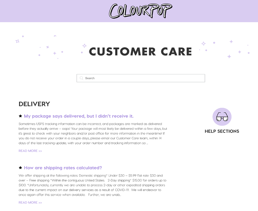
When you have a lot of FAQs, you need to make it easy for customers to navigate through them quickly. One option is to provide an extract for longer answers so they can see whether an FAQ is relevant to them without clicking on it, as shown here by Colourpop Cosmetics. They've also included a search bar to assist customers with finding the relevant query.
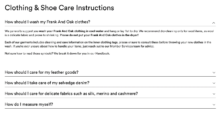
In this good example from Frank and Oak, we can see how product-specific FAQs add huge value to the brand experience post-purchase. Providing detailed instructions for how to look after clothing and accessories helps to prevent adverse situations that could damage the brand's reputation.
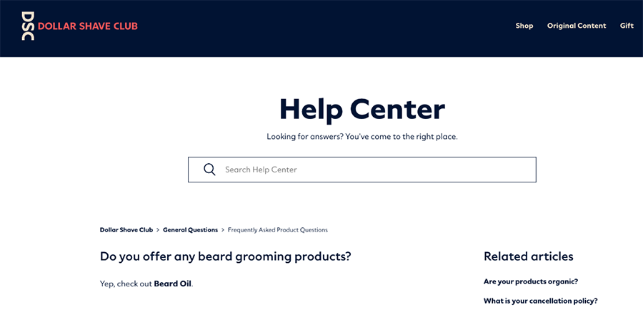
This FAQ answer might seem pretty sparse, but Dollar Shave Club is giving shoppers all the information they need simply by directing customers to the relevant product page. The lesson is: Don't feel the need to write lengthy answers to FAQs just to take up space. If the information can be covered a sentence (or even just a few words) the FAQ is doing its job.
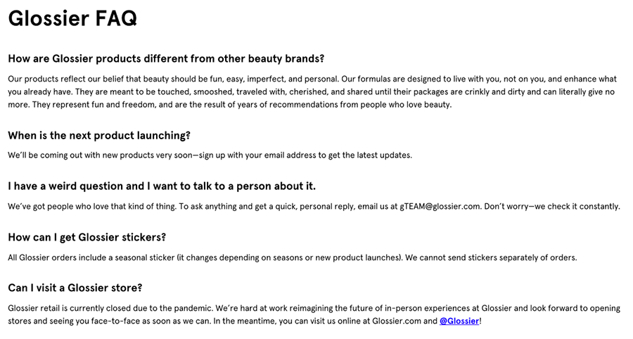
Beauty brand Glossier does a great job of promoting the ethos of its brand while also providing answers that push potential customers toward purchasing.
In addition to addressing more common concerns, their FAQ page also includes broader questions aimed at enticing customers to choose Glossier over competitors. FAQs like ‘How are Glossier products different from other beauty brands?' create a valuable space to make their very best marketing pitch.
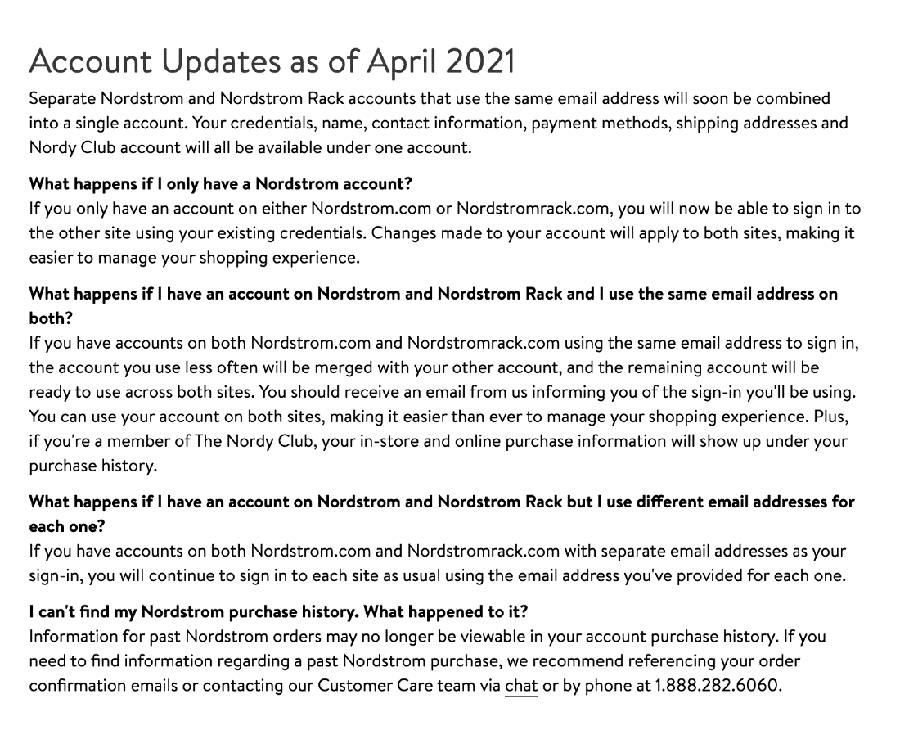
Nordstrom's knowledge base is very in-depth and the department store frequently adds or updates sections dedicated to current events, such as storewide sales. When Nordstrom introduced a merger of Nordstrom and Nordstrom Rack customer accounts, it added a dedicated FAQ section so that customers can easily find all the information they need relating to this change.
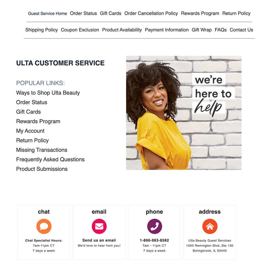
Ulta Beauty's knowledge base not only answers FAQs but makes it easy for customers to escalate customer service issues if they can't find the answer they're looking for. The bottom of the page offers a variety of communication options to cater to customer preferences, including live chat, phone, and email.
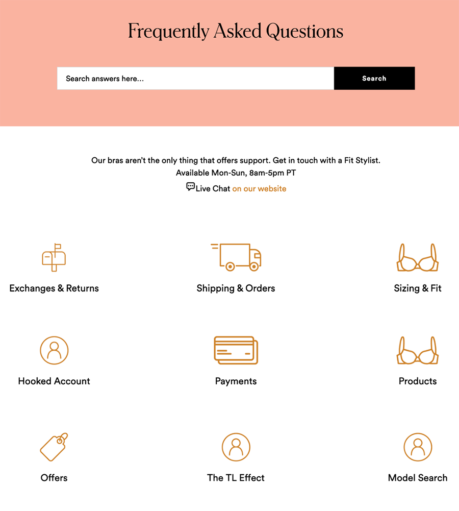
Lingerie brand ThirdLove offers a great example of how to carry your brand identity from the homepage to your FAQ pages. The pink header and graphic icons are a perfect match for their style, while the fun and cheeky copy help to inject personality into their knowledge hub. This also makes it one of their strongest landing pages in the case that consumers are accessing FAQs straight from the search results.
Every e-commerce merchant will agree that FAQs are an essential part of their website, but few are using FAQ pages to their full potential. When optimized correctly, your FAQ page is a highly effective tool for advancing the customer journey, easing the burden on your customer team, and building trust in your brand. By following the steps above, you can create a great FAQ page that enhances the customer experience and boosts conversions.